I made an interesting discovery recently while spelunking in our time tracking system. The distribution of sick time, over all the people we’ve ever employed, very closely follows a logarithmic distribution.
All Atomic employees track their time on all activities, whether billable client projects or internal work. We’ve been doing that since we started, so our time tracking tool has nearly 13 years worth of data (679,263.25 hours, over 86 people). We find this data invaluable for analyzing our business, making staffing decisions, estimating, planning, and juggling responsibilities.
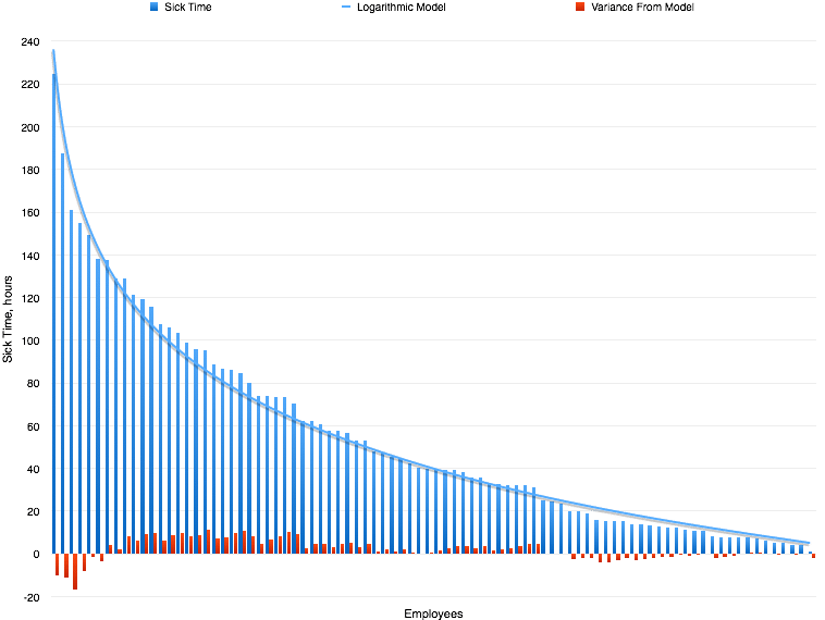
The graph below shows total sick time (blue bars) for all past and current employees, sorted by largest to smallest, left to right. The smooth blue curve is a logarithmic function. It has an R2 of 0.989 with the data. The red bars show absolute variance of each blue bar, versus the log function, at each point.
So what?
“But!” I can hear you protest, “you’re mixing together employees of 13 years with those that have worked for only 2 months. This doesn’t mean anything!”
True, I’m not normalizing by employee tenure. When I noticed this relationship, I wasn’t checking on any particular employee. I was just exploring sick time data. I was playing scientist, not pointy haired boss.
But I don’t agree that this doesn’t mean anything just because it isn’t normalized to employee tenure.
UPDATE 4/2/2015: Mike Marsiglia normalized our sick time data to employee tenure (sick hours per year worked) for everyone we’ve ever employed. It’s very interesting to see the exact same distribution as the graph shown above for raw sick time data. With an even higher R2 of 0.9893, the sick time data when normalized to employee tenure follows a natural log distribution.
Our sick time policy has always been, “take what you need”. It’s fine at Atomic to stay home when you’re sick. In fact, I’d argue that it’s encouraged — no one wants to share germs, or have germs shared with them. Sometimes people aren’t so sick that they can’t work from home; sometimes they are. Our policy doesn’t force you to work when you’re sick. Nor does it incentivize you to take sick time because you’ve “earned” it. Our sick time is just for you, not for when you’re tending sick spouses or kids. Our short-term disability doesn’t kick in until 2 weeks of absence, so sick time covers stuff like recovering from a simple operation, but not longer-term illness. Thus our sick time data represents the time during the work week when people are too sick to work from common complaints, nothing more or less.
Some people get sick more than others. People are more or less able or willing to work when they are sick. Some employees have worked at Atomic for years, some for only weeks. What I find interesting is that when you throw them all together, you find that sick time distributes itself very well according to the natural log function
y = -52 ln(x) + 236
where y is the number of hours of sick time, and x is simply the index of an employee in the sorted list.
A useful model
Here’s where I think what I’ve observed might be useful. Because:
- we have a lot of data (nearly 13 years across 86 individuals),
- our data is tracked very accurately,
- our sick time policy doesn’t distort the data,
- the people of Atomic have a high degree of personal integrity,
- and the natural log function shows up in other places in nature,
I’m going out on a limb and claiming that this function is an accurate predictor of the natural distribution of sick time in groups of people similar to Atomic’s employees. (That group skews male, young, educated, and Caucasian when compared to the population as a whole.)
If my theory is true, then I can also say that the consistency of the data backs up my own experience and belief, which is that Atoms aren’t using sick time inappropriately or with selfish intention. If they were, I wouldn’t see such a high degree of conformance of the data to a natural log model. If cheaters were common, the data wouldn’t fit so neatly to a simple curve.
I realize I’m making a circular argument. I’m deriving what I claim to be a sort of natural law of sick time from a data set, then using the derived curve to claim the data shows consistency with the law.
I’d love to know if other companies with similar employee demographics (and detailed time tracking habits) have data that looks similar. That would help independently confirm the claim I’m making that the natural log curve represents a real phenomenon of illness in people, not just a coincidence.
Assuming I’m on to something, then comparing sick time data to the model might help you to uncover sick time policies or practices that are distorting people’s behavior, such as working when they are sick, or using sick time for something other than being too sick to work.
Who else has data to contribute?
More Analysis
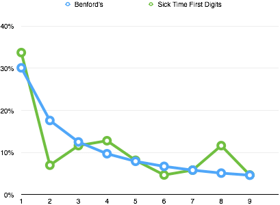
UPDATE 4/4/15 Per Michael Barton’s suggestion in the comments, I ran our raw data (in hours) against Benford’s Law (a relationship of the prevalence of first digits in data sets). Not a great match.
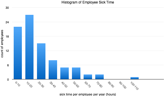
Per a suggestion on Hacker News I graphed a histogram of sick time per year by 10 hour ranges:
Raw Data
Atomic’s fifth value mantra is “act transparently”. We often live that by sharing what we’ve learned outside the company. To that end, you can find the raw, anonymized employee sick time data I used in this blog post below. If you learn something interesting from the data, please share in the comments.
- Attention: Spending Your Most Valuable Currency - February 10, 2022
- Slicing the Revenue Pie in a Multi-Stakeholder Company - July 30, 2021
- Commercial versus Existential Purpose - July 19, 2021
- How I Misunderstood Mentorship and Benefited Anyway - June 16, 2021
- Sabbath Sundays and Slow Mondays - June 4, 2021